
What to Put on Your Tyre Shop’s Website Homepage (That Actually Gets You Calls)
🕒 Reading time: 4 minutes
When someone lands on your website, they decide in seconds whether to call you or click away.
Your homepage isn’t just decoration — it’s a tool. And if it’s not doing its job, you’re losing easy bookings.
Here’s what tyre shops and mobile fitters should have on their homepages to actually get results.
🧠 First: Think Like a Customer
They’re not here to read your life story. They’re here because they need a tyre, a repair, or a quote — fast.
Your homepage should answer 3 questions within seconds:
- Where are you?
- What do you do?
- How do I contact you?
If any of those are missing or hard to find… you’re losing calls.
✅ 7 Essentials Every Homepage Should Have
1. Clear Phone Number at the Top
Make it easy to call — big, bold, clickable.
Especially important on mobile (which most people use).
Bonus tip: Add a “Call Now” button that stays visible as they scroll.
2. Simple Intro: What You Do + Where You Work
Skip the jargon. Just tell people who you are, what you offer, and where.
Example:
We’re a family-run tyre shop in Coventry offering new tyres, puncture repairs and same-day fitting. We also do mobile tyre fitting across Warwickshire.
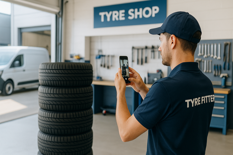
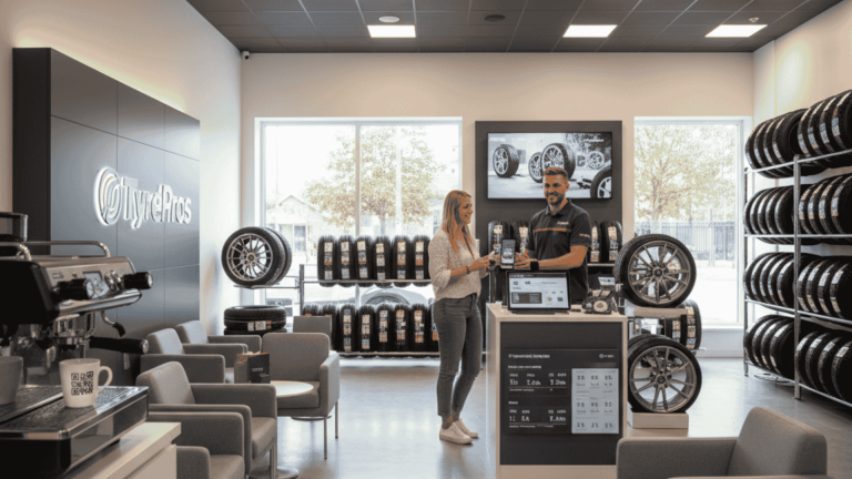
3. Photos of Your Shop, Van, or Team
No stock photos. Use real pictures — even taken with your phone.
People want to see you’re real, local, and trustworthy.
4. Your Google Reviews or Stars
If you’ve got great reviews, show them off right away.
Add a review widget or screenshot your best ones and display them proudly.
Social proof builds trust — fast.
5. Services You Offer
List them clearly, ideally with icons or bullet points:
- New tyres
- Mobile tyre fitting
- Puncture repair
- Wheel balancing
- TPMS sensors
- Locking wheel nut removal
- Tracking / alignment
People should know what you do at a glance.
6. A Call to Action (CTA)
Tell them what to do next. For example:
- “Call now to book”
- “Message us on WhatsApp”
- “Get a fast quote”
- “Check stock and book online”
One main button or message is better than five links.
7. Mobile-Friendly Design
Test your homepage on your phone.
- Is the text readable?
- Is the phone number easy to tap?
- Does it load fast?
Most tyre customers are searching while out and about. If your site’s not mobile-ready, you’re invisible.
⚠️ Common Mistakes to Avoid
- Tiny text or blurry images
- No contact info above the fold
- Outdated hours or services
- Too much waffle, not enough action
- Stock photos that scream “template”
🧰 Tyreroom Tip
You don’t need a fancy site — just one that’s clear, fast, and makes it easy to trust you.
We see tyre shops spending £1,000s on sites that still don’t convert.
It’s not about how it looks. It’s about what it says.
Final Thought
Your homepage is your online shop front.
Make it look alive. Make it easy to call.
And make sure it answers the 3 big questions — fast.
Because your next customer is already looking.
Make sure they don’t bounce to the next guy.